Consumer crypto exchange · Argentina
Bitennial
Crypto for people who find crypto intimidating.
- Fintech
- Crypto
- Mobile First
- Design System
01 / Context
Investing without the jargon wall
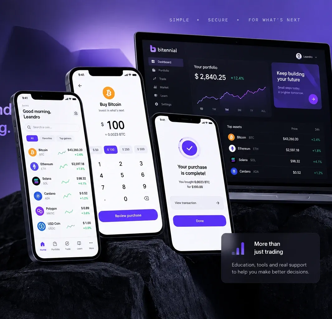
Crypto products tend to assume a level of fluency most first-time investors don’t have. Bitennial explored how to close that gap with a guided experience around discovery, learning and investing — mobile-first, for the Argentine market, where crypto is mainstream but trust in any given platform is not.
02 / Evidence
Understanding where confidence breaks
Early conversations with curious and first-time investors kept surfacing the same friction: the language assumed fluency, the interfaces assumed confidence, and nothing explained what happened next. Three themes shaped the product from there — complexity, trust and confidence — with education as the thread running through all three.
03 / The product challenge
The first investment shouldn't require expert knowledge
The experience needed to reduce uncertainty without oversimplifying a financial decision. At every step, someone needed to know: what am I buying, how much, what happens next, and can I trust this.
04 / First investment
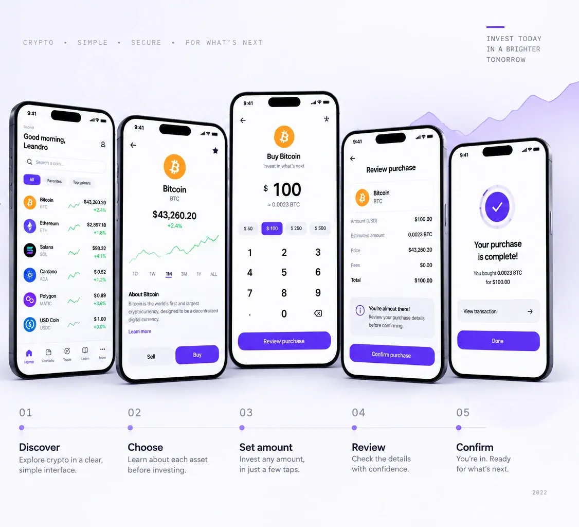
From curiosity to confidence.
05 / Key product decisions
- 01
Buy/sell as a primary action
Investing is visible on the home screen, not hidden behind complex navigation.
- 02
Education in context
Explanations appear at the moment information becomes relevant, so users can keep learning without leaving the investment journey.
- 03
Trust through transparency
Amounts, prices and confirmation states are always visible before a decision is made.
- 04
Simplicity without hiding control
Unnecessary complexity is removed; the information that matters for a financial decision stays in view.
06 / Product ecosystem
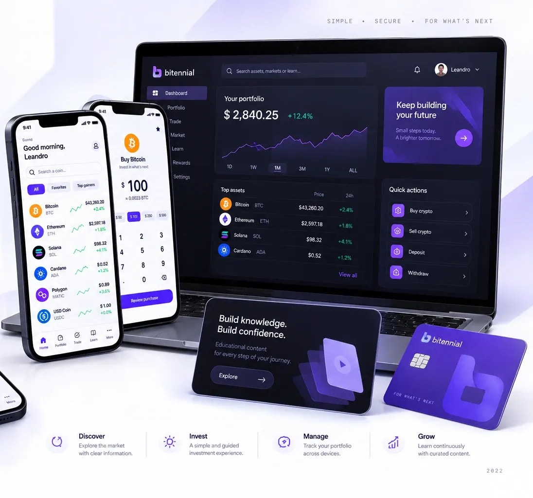
A complete crypto experience, across devices.
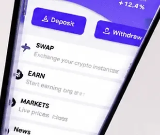
Buy/sell, portfolio and markets stayed the daily-use surface on both mobile and web; education and account security sit one tap away, not hidden in a separate section.
07 / Design language
Designed to make complexity feel calm.
Color
Purple/indigo identity, balanced with neutral surfaces.
Type
Hierarchy built for scanning numbers fast.
Components
Consistent actions, cards and rows across the product.
08 / Final experience
The final experience
09 / Outcome
The resulting experience
The final product reduced the distance between discovering an asset, understanding the decision, and completing an investment — one path instead of a feature-heavy interface to navigate. Buy/sell stayed the primary surface as the product grew, and transaction details stayed visible before commitment instead of appearing only at the end.
10 / Learnings
- Simplicity is a product decision. Removing complexity means knowing which information someone actually needs at each step, not showing less.
- Trust has to be visible. In a financial product, reassurance comes from clear states, amounts and expectations — not a security page.
- Education works best in context. Nobody should have to leave the journey to understand the decision they’re making.
- The first successful action matters most. Whether crypto feels understandable or intimidating gets decided on the first purchase.