Telecom · Performance marketing · Brazil
TIM Ultrafibra
A performance-driven checkout for broadband sales
- Web
- Mobile
- Checkout
- Conversion
01 / Context
Paid traffic, high intent, one job
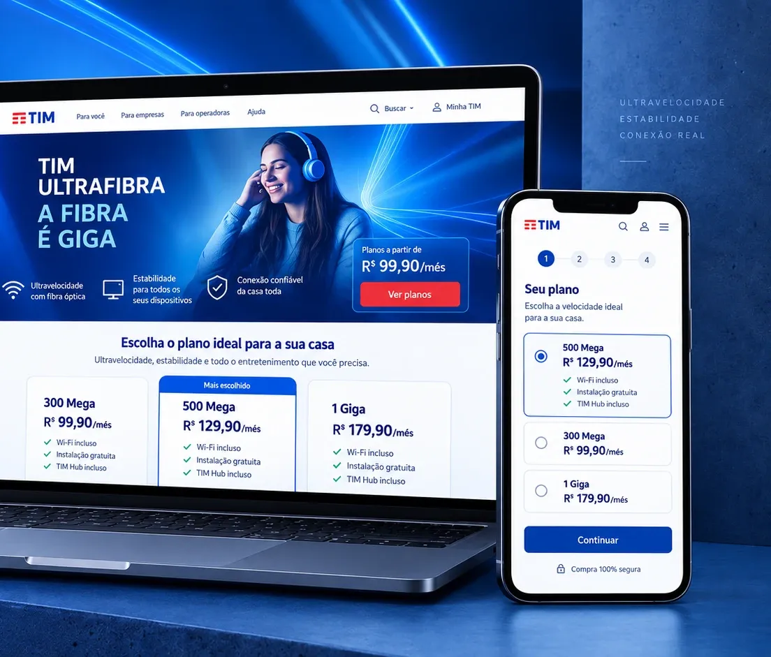
Most users weren’t casually browsing. They were arriving from acquisition campaigns with a clear intention: understand the offer, confirm availability and move toward signup.
That meant every unnecessary decision, unclear step or dead end added friction to an already expensive funnel.
02 / The challenge
Coverage is the moment it breaks
Broadband availability depends on the customer’s address, making coverage validation unavoidable.
The problem was what happened when users reached that moment: unclear feedback, unsuccessful searches and dead ends could quickly turn strong purchase intent into abandonment.
03 / Evidence
From real needs to a simpler journey
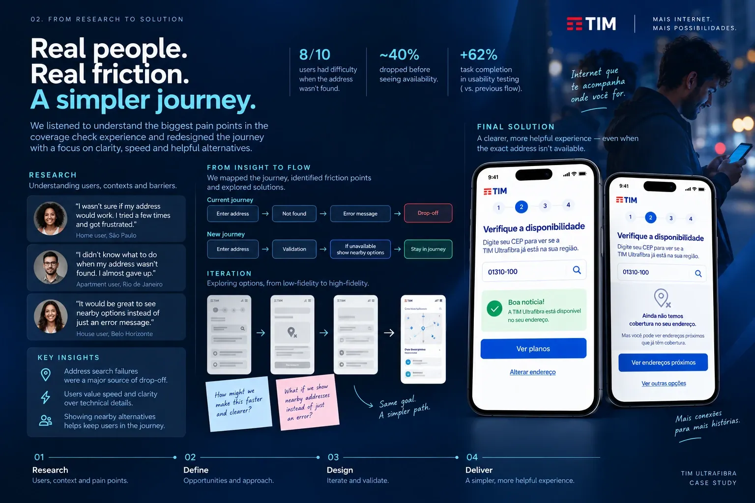
Research helped identify where users lost confidence and where the funnel became unnecessarily complex. Instead of treating every artifact as a deliverable, we used it to focus the design on the highest-risk moments of the journey.
04 / Key design decisions
- 01
Plan first, details later
Let users make the meaningful product decision before asking for personal information. Choosing the plan first creates commitment before the higher-effort form fields.
- 02
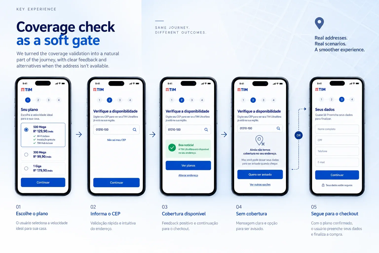
Coverage check as a soft gate
Coverage validation was necessary, but it didn't need to feel like a blocker — clear feedback and a path forward even when the address wasn't available yet.
- 03
One decision per step
Each stage of checkout focused on one primary task and one dominant action, reducing cognitive load and making the experience easier to scan on mobile.
- 04
Landing and checkout as one system
The acquisition landing page and checkout were designed as parts of the same journey — consistent visuals and predictable patterns instead of disconnected experiences.
05 / Coverage experience
Turning a blocker into a path forward.
Same flow, two outcomes. A confirmed address moves straight to checkout; an unavailable one gets a real next step instead of a dead end.
06 / Final experience
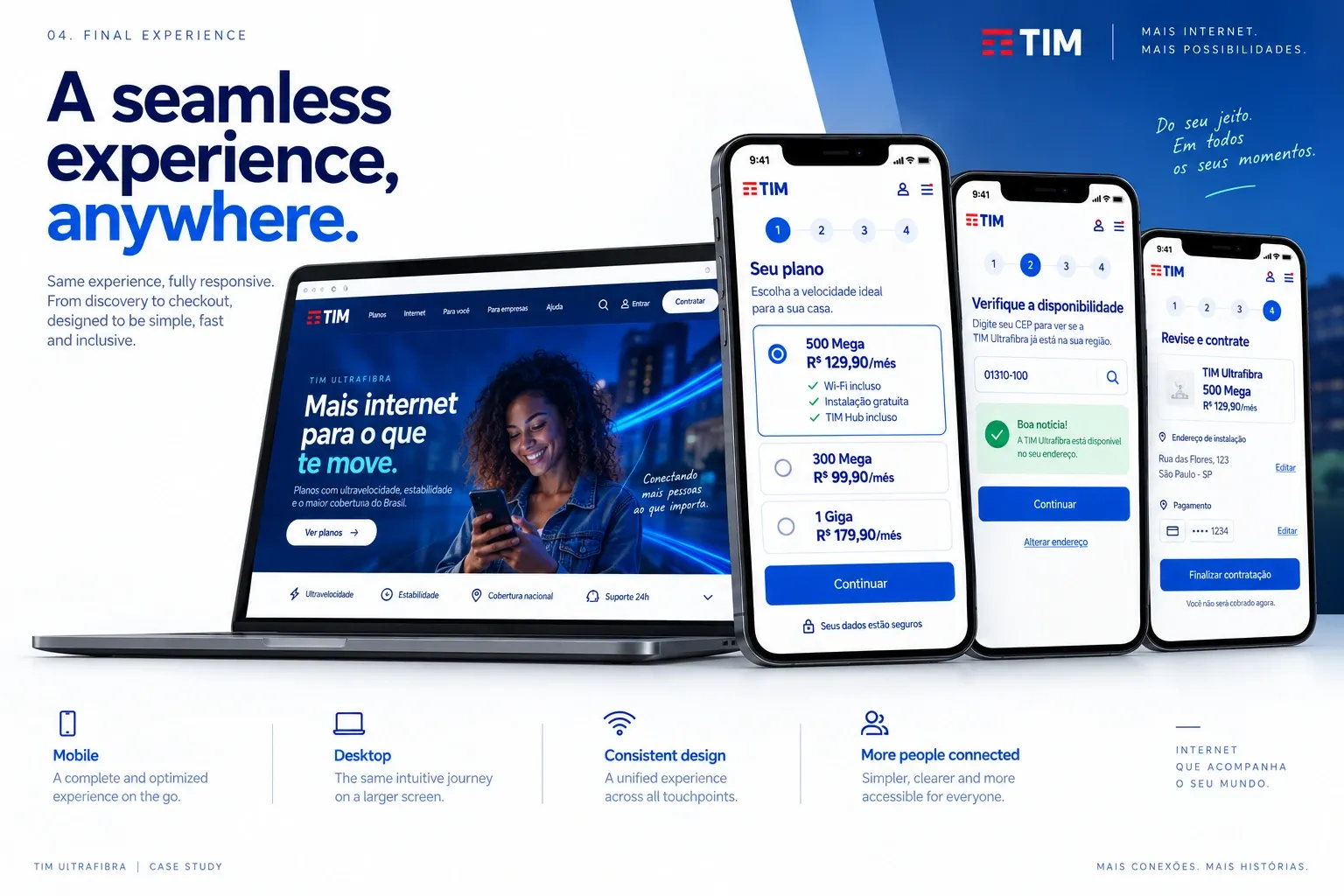
A seamless experience, anywhere
The same journey, unchanged in logic or hierarchy, from desktop to mobile.
07 / Outcome
A shorter path from intent to signup
Clearer coverage validation and fewer unnecessary decisions before plan selection.
08 / Learnings
- Focus design effort on the highest-risk point of the funnel — not the step that’s easiest to redesign.
- Commitment before effort can reduce perceived friction. Letting people pick a plan before asking for their details changed the emotional shape of the checkout.
- Conversion decisions need an explicit hypothesis, not only visual rationale.