BURGER KING · RESTAURANT BRANDS INTERNATIONAL
Designing the next generation of the Burger King guest experience.
From ordering and checkout to loyalty, navigation, personalization, gamification and kiosk, I worked across some of the most important moments of Burger King's digital guest journey.
View live product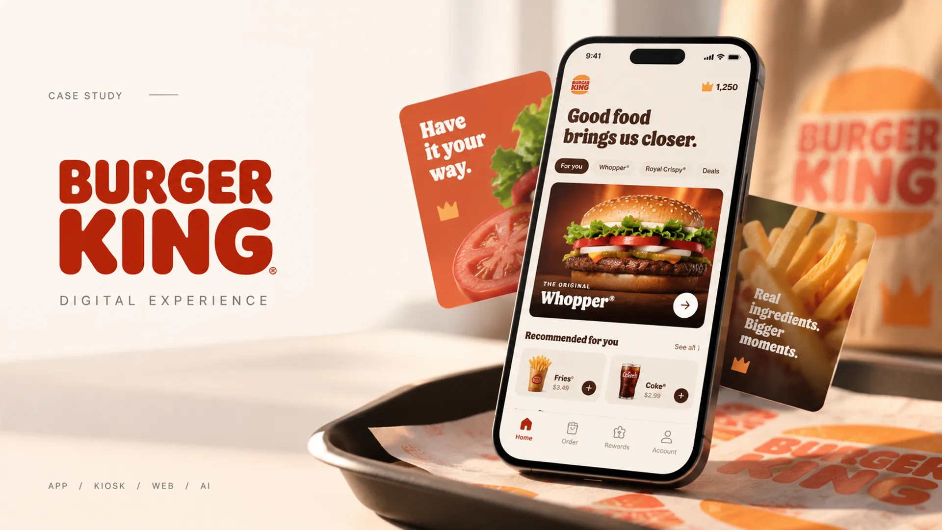
01 / Product ecosystem
One brand. Multiple users. Multiple contexts.
Working across critical guest journeys and operational experiences throughout the Burger King ecosystem — mobile app, web, kiosk, franchise management and restaurant operations.
- 01Consumer
- 02Restaurant
- 03Operations
- 04AI-enabled workflows

- 01
Mobile app
Guest ordering, loyalty and engagement.
- 02
Web
Guest-facing digital experiences.
- 03
Kiosk
In-restaurant ordering.
- 04
BK Assistant
Franchise management and operational SaaS.
- 05
KDS
Kitchen Display System used by restaurant crew.
- One brand
- Multiple users
- Multiple contexts
- Shared product system
02 / Cart & checkout
Reducing friction at one of the most critical moments in the journey.
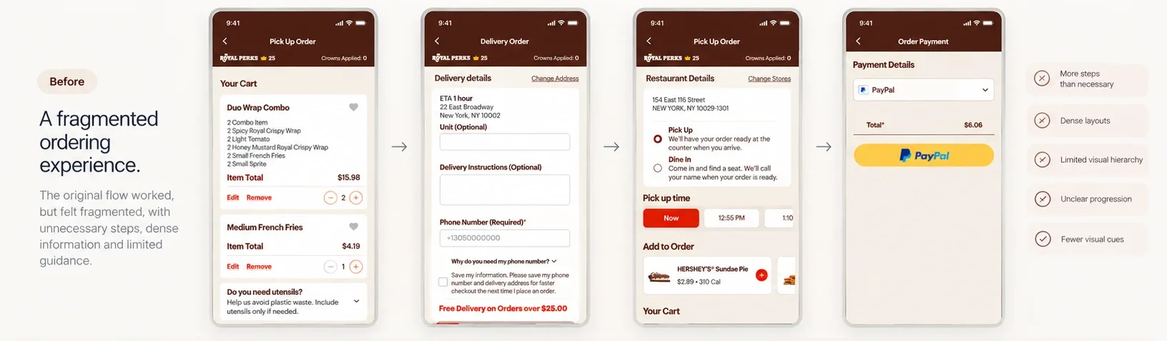
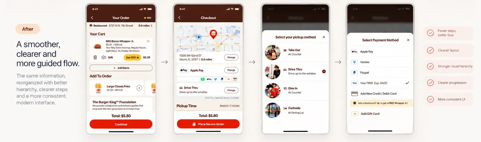
Checkout had accumulated multiple steps and dense information — the redesign focused on simplifying the journey, improving hierarchy and keeping important decisions in context.
What informed the design
- Existing experience
- User testing
- Design iteration
- A/B testing
Before
After
Design decisions
- 01
Fewer steps
Related information was consolidated to reduce unnecessary transitions and keep guests moving toward order completion.
- 02
Recognition over recall
Important choices became more visual and easier to understand, instead of relying only on labels and controls.
- 03
Context instead of navigation
Pickup and payment decisions could happen through contextual action sheets instead of pushing guests through additional screens.
Validation
- 01Prototype
- 02User testing
- 03Observe friction
- 04Iterate
- 05A/B experiment
- 06Rollout
User testing. Helped us evaluate usability and understanding.
Experimentation. Helped us understand behavior at scale.
Impact
Confirmed impact
+5%
Conversion
$5M+
Incremental revenue
In the first months after launch.
03 / Menu & customization
Making complex orders feel simple.
Flexibility creates complexity.
The UX challenge
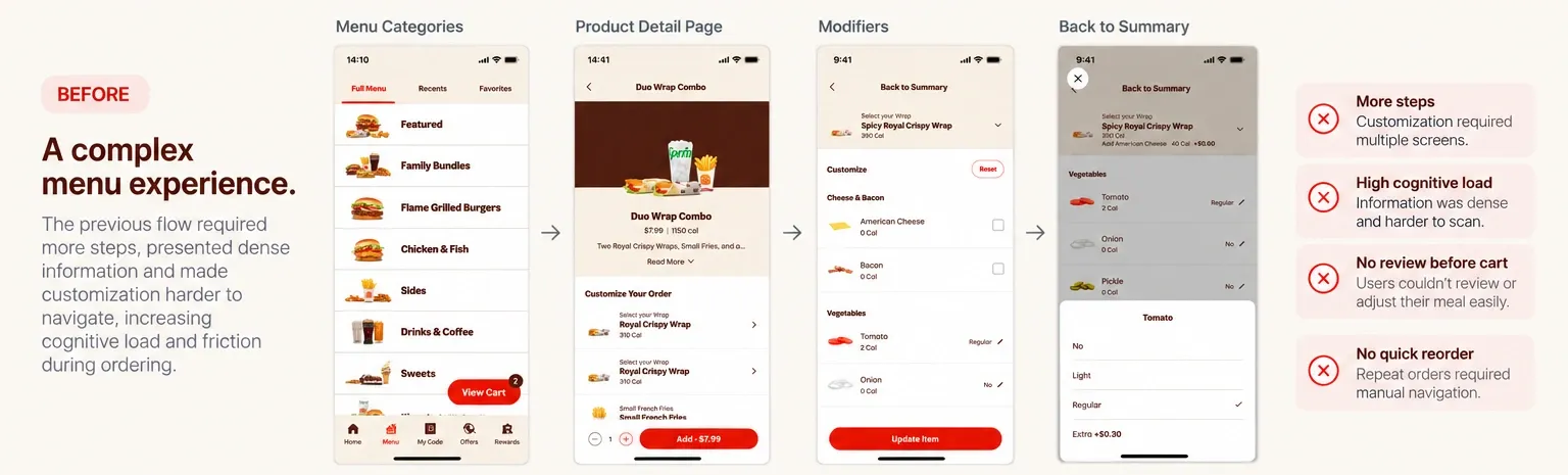
Ordering flexibility can quickly become complexity. The menu and customization experience had accumulated dense information, multiple steps and interaction patterns that made it harder for guests to understand their options and move confidently toward checkout.
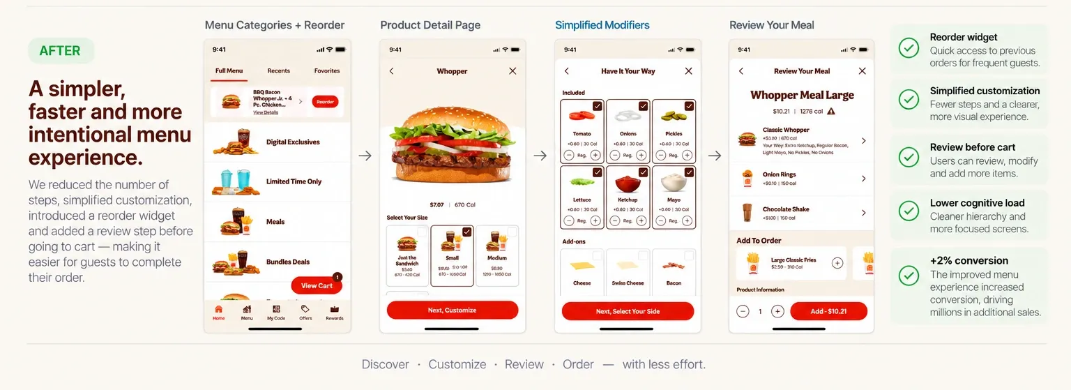
We redesigned the journey from menu discovery to meal review — simplifying customization, introducing a faster path for repeat behavior, and giving guests more control before adding an order to cart.
What informed the design
- Existing experience
- User testing
- Design exploration
- A/B testing
Friction
Repeat orders required re-discovery. Returning guests had to navigate the menu again even when ordering familiar items.
Limited review. Guests had limited opportunity to understand and adjust the complete meal before moving toward cart.
Product insight
Not every order starts with discovery
For returning guests, familiar orders were an opportunity to shorten the path to ordering — so we introduced a Reorder entry point directly in the menu.
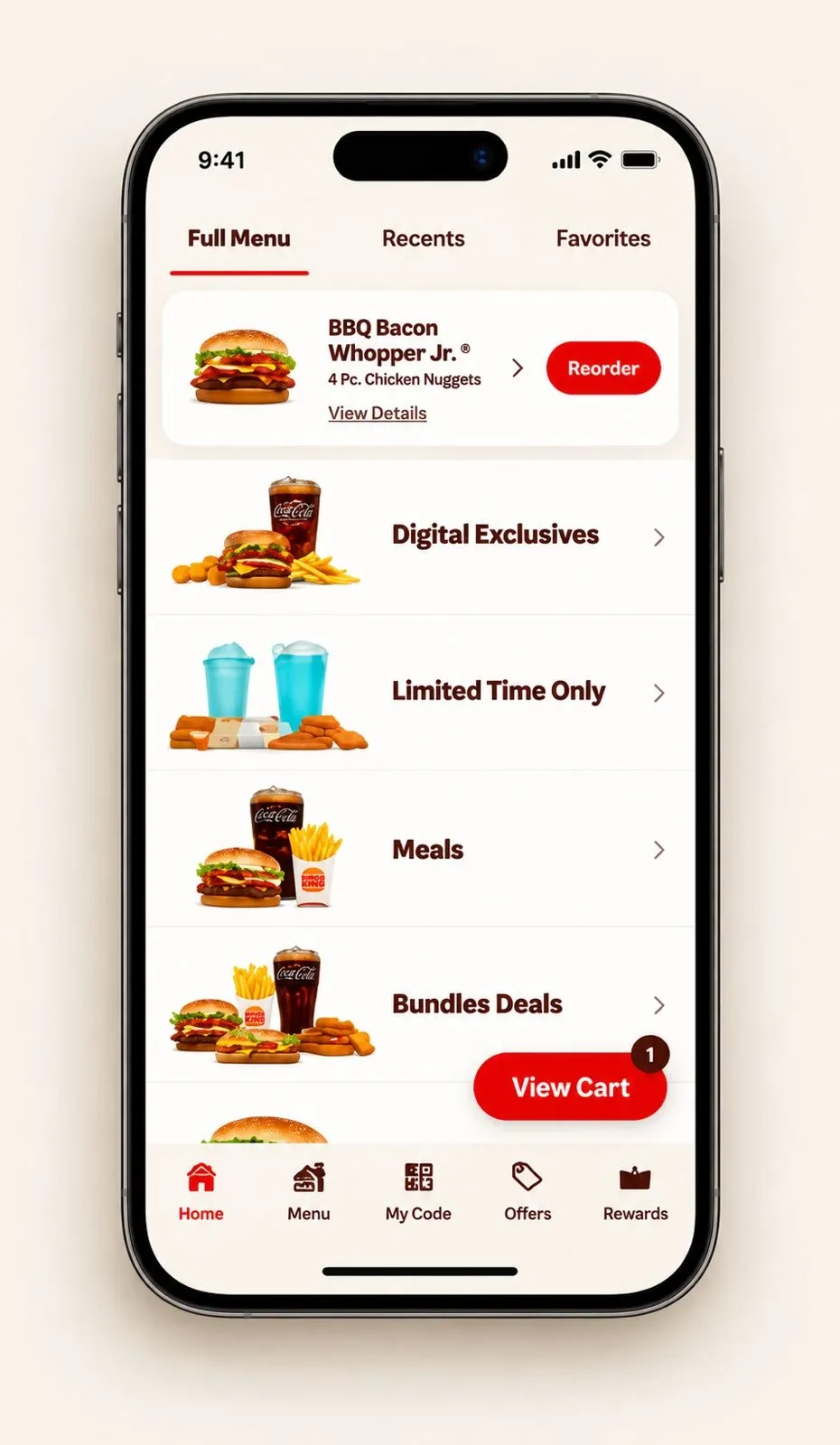
- 01Less searching
- 02Faster recognition
- 03Faster path to order
Reorder was introduced after testing the concept with guests and validating that a faster path to familiar orders could improve the ordering experience. Production results showed a positive impact on conversion.
Simplifying choice without removing control
Customization needed to support many possible choices without feeling like configuring a system — so we explored multiple interaction models and iterated with users.
- 01Multiple concepts
- 02Prototypes
- 03User testing
- 04Iteration
- 05A/B experiment
Design decisions
- 01
Progressive decisions
Smaller, focused choices.
- 02
Visual recognition
Options are easier to scan.
- 03
Clear selection state
Guests understand what is selected.
- 04
Forward momentum
Clear next actions.
Before
After
Review before committing
A checkpoint before the cart
Before moving to cart, guests can now review the complete meal, understand their selections, make modifications and add complementary items — without restarting the ordering flow.
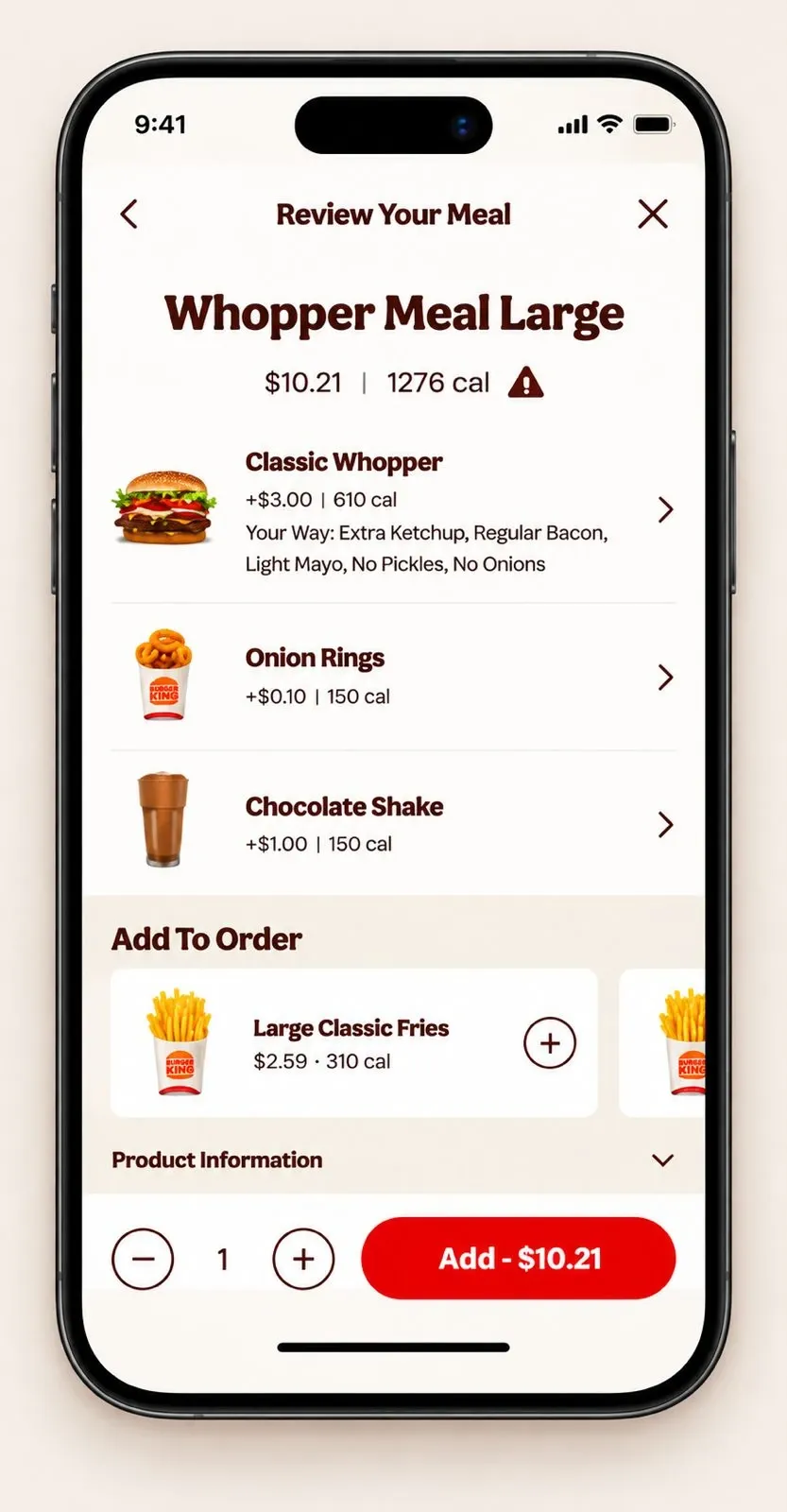
- 01
Verify
Understand exactly what is being ordered.
- 02
Modify
Return to individual items when something needs to change.
- 03
Add
Discover complementary items while still in the meal context.
Validation
- 01Design alternatives
- 02Prototypes
- 03User testing
- 04Iteration
- 05A/B test
- 06Winning experience
User testing. Helped evaluate whether guests could understand and navigate the new customization model.
A/B testing. Helped determine whether the improved experience changed real ordering behavior at scale.
Impact
Confirmed impact
+2%
Conversion
At Burger King’s scale, even a small conversion improvement represents meaningful incremental impact.
Menu & Customization answers how do we help guests build the right order? Cart & Checkout answers how do we help guests complete that order? — two connected but distinct product problems.
- 01Discover
- 02Reorder / Select
- 03Product
- 04Customize
- 05Review
- 06Order
04 / Expanding the guest experience
Home, loyalty and location.
Arriving, returning and finding a restaurant are three parts of the same guest journey — each needed less friction, clearer hierarchy and stronger continuity with the brand.
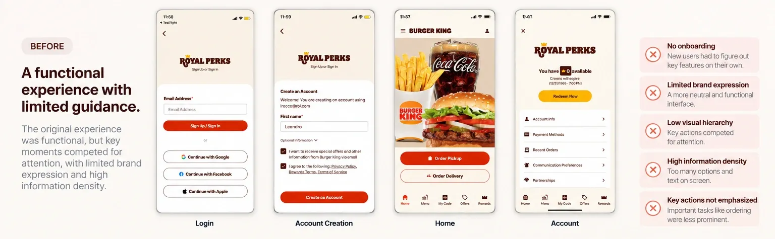
Home & navigation
The previous experience was functional, but key moments competed for attention and relied heavily on neutral surfaces with limited visual guidance. The redesign introduced stronger hierarchy, more intentional use of Burger King’s brand colors, clearer navigation, and onboarding for permissions and personalization.
- Guidance
- Hierarchy
- Brand expression
Before
After
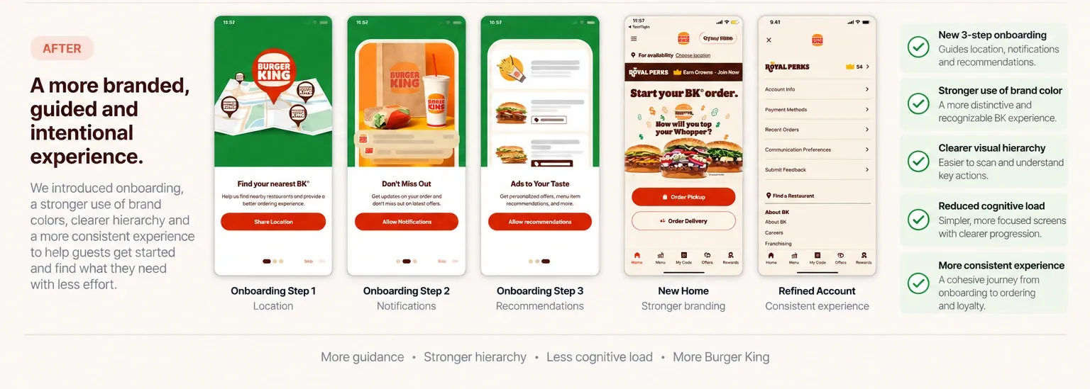
Onboarding is where the app asks for something — personalization, location, notifications — before it’s earned much trust yet. Each moment pairs a short, purposeful animation with a plain-language reason, so granting access reads as part of the experience rather than an interruption.
- 01Personalization
- 02Location
- 03Notifications
- 01Personalization
- 02Location
- 03Notifications
- 01
Guidance before complexity
A short onboarding sequence introduces location, notifications and recommendations progressively — not all at once.
- 02
A more consistent guest experience
Home, account, loyalty and navigation were treated as parts of the same system rather than isolated screens.
Loyalty
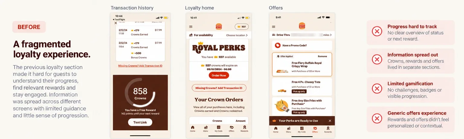
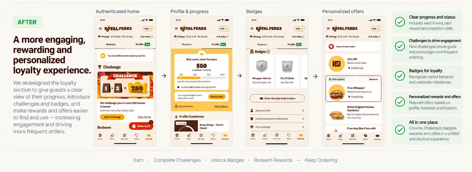
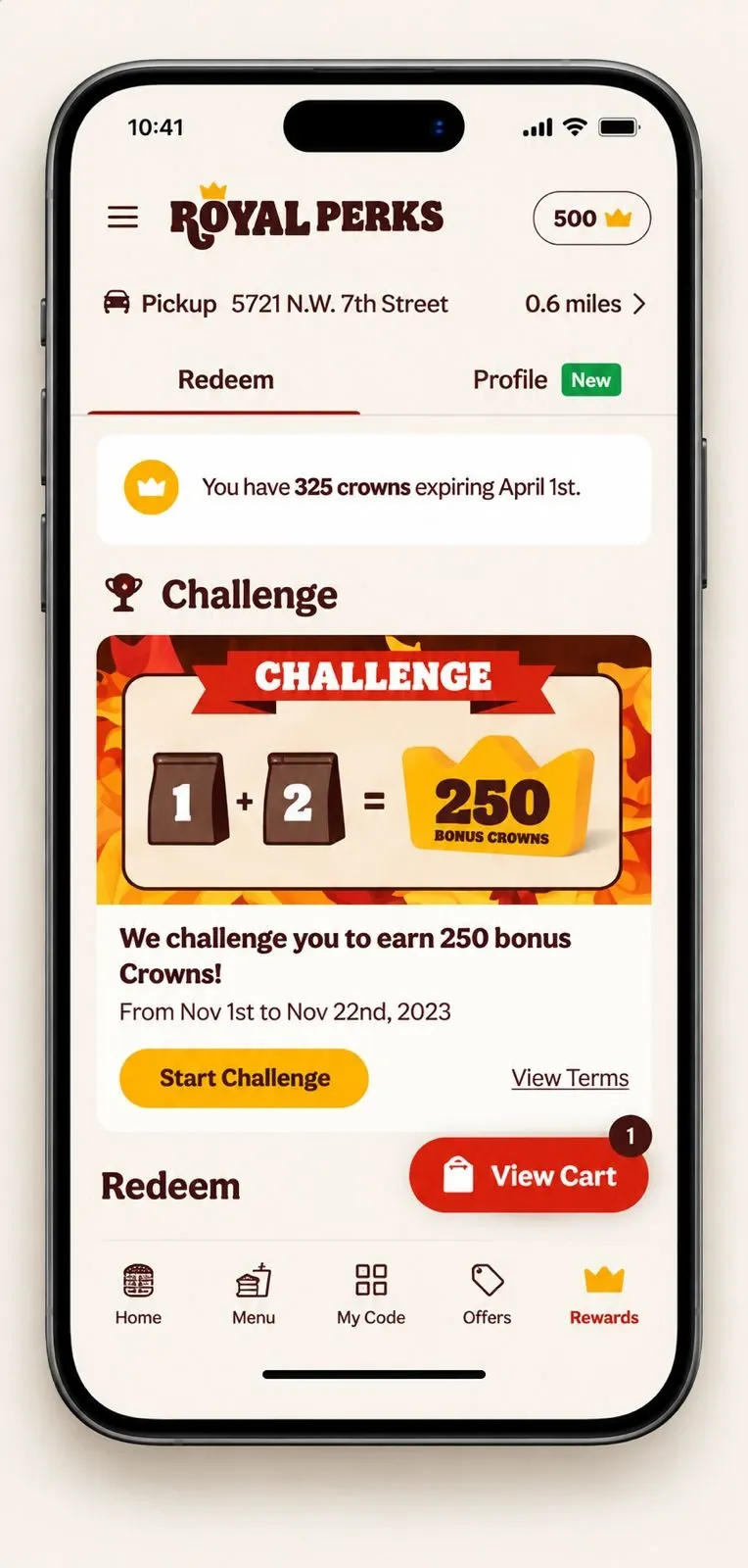
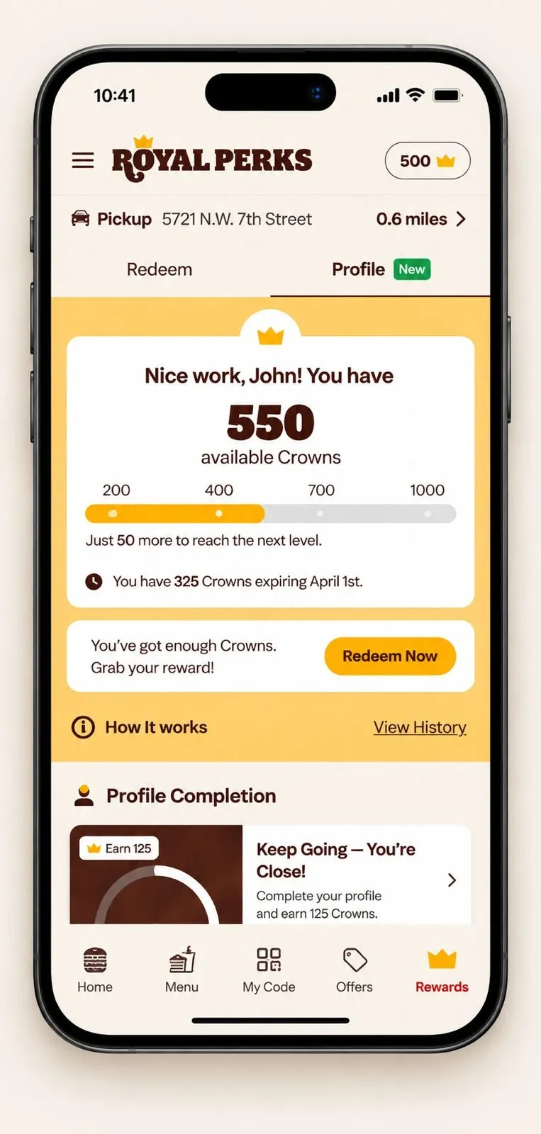
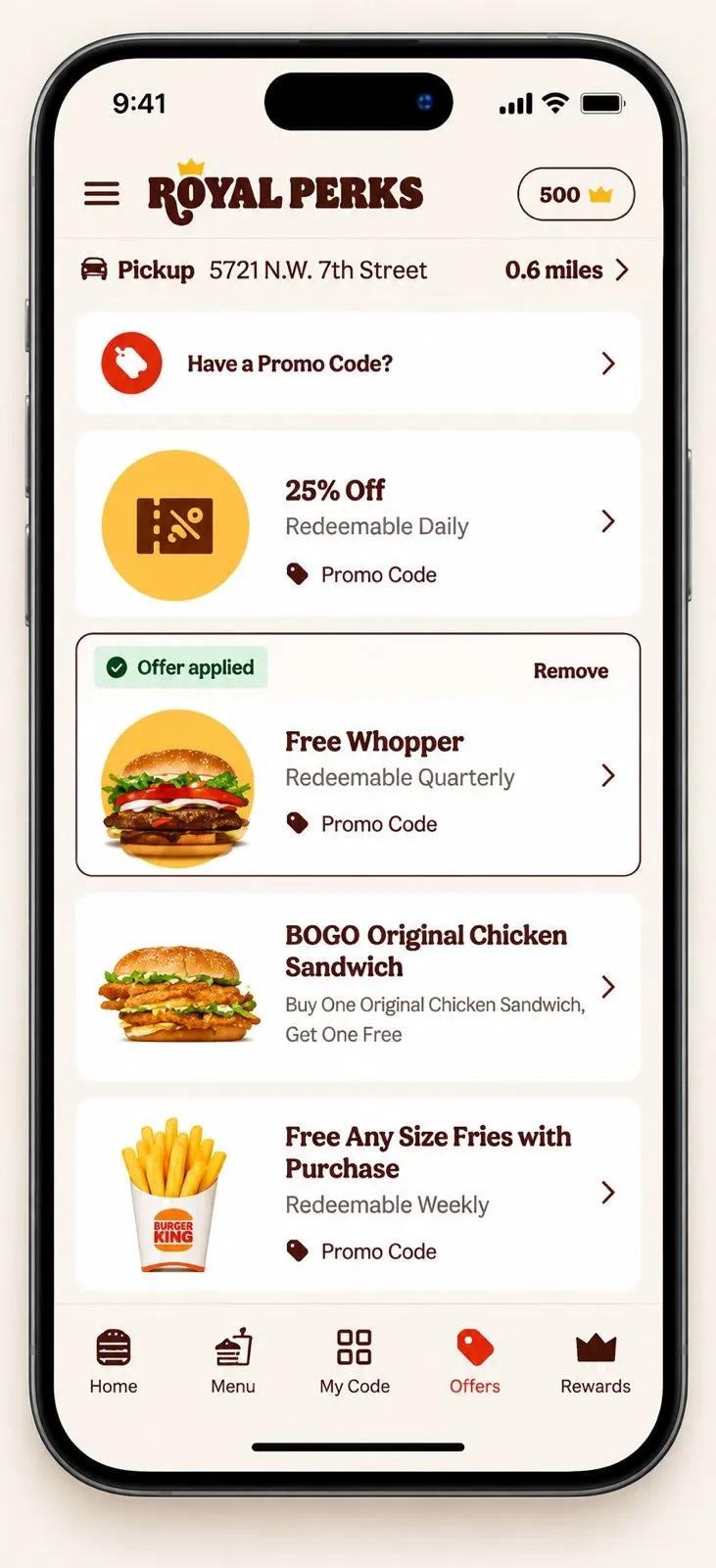
Royal Perks already gave guests ways to earn and redeem value. We redesigned the experience around progression — bringing Crowns, challenges, profile progress, badges, rewards and offers into one connected system that gives guests more reasons to engage and return.
Before
After
- 01Goal
- 02Action
- 03Progress
- 04Reward
Explicit goals guests can work toward, instead of only accumulating Crowns over time.
Makes Crown balance, progress toward the next reward, and milestones visible in one place.
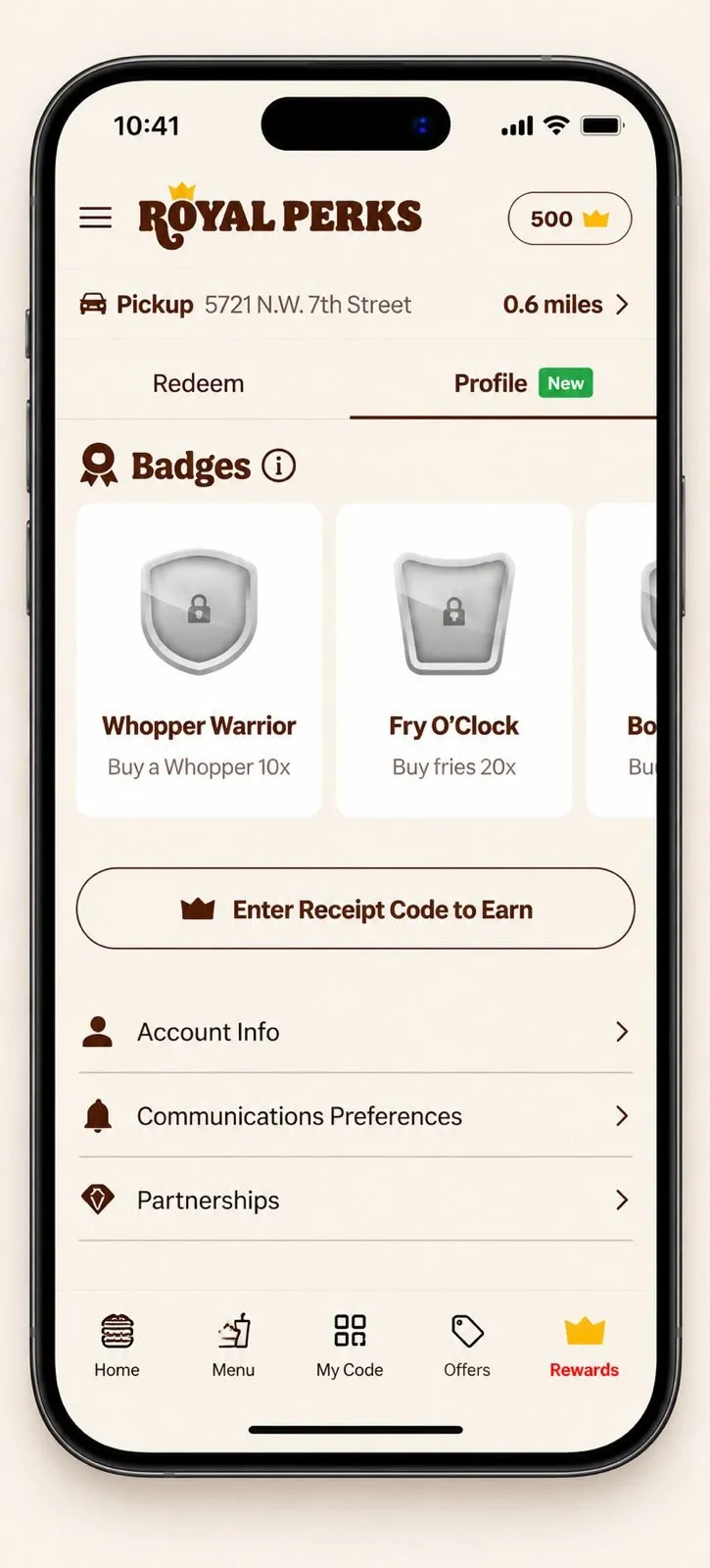
Recognizes repeat behavior and achievements beyond Crown balance — Whopper Warrior, Fry O’Clock.
- Clear hierarchy
- Visual recognition
- Clear states
- 01Earn
- 02Complete
- 03Progress
- 04Unlock
- 05Redeem
- 06Return
Location — pickup & delivery
Selecting a restaurant shouldn’t feel like leaving the ordering journey.
The UX problem
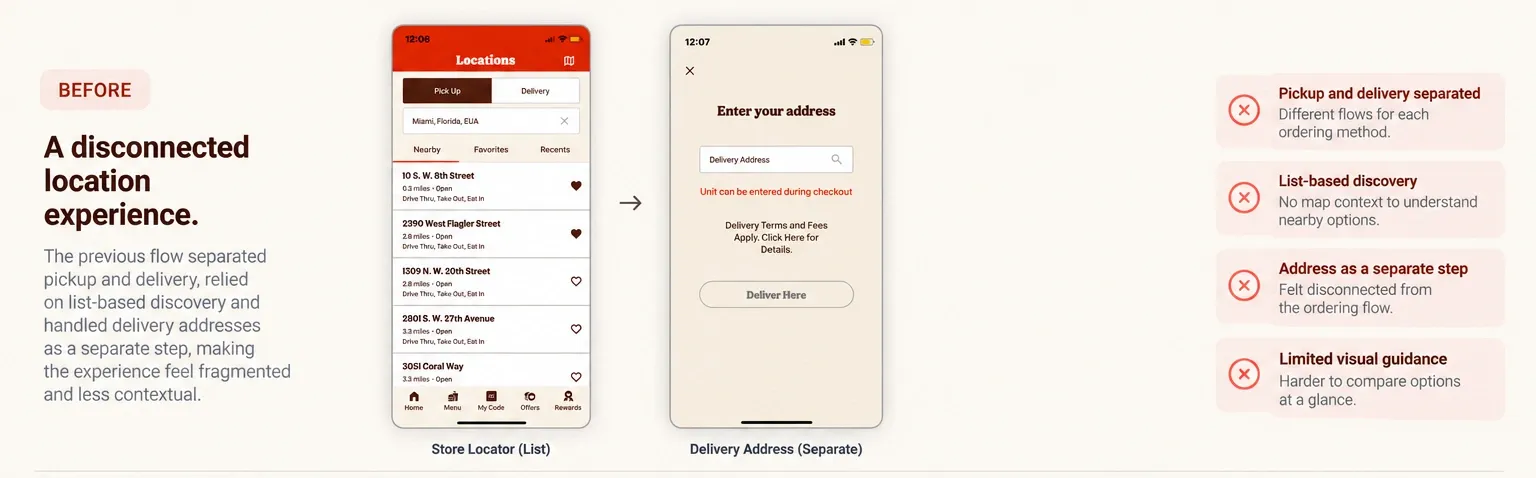
Location became context, not a prerequisite. The previous flow separated pickup and delivery, relied on list-based discovery, and handled delivery addresses as a separate step. We redesigned it around a map-based search, saved delivery addresses, and one consistent location model across pickup and delivery — preserving the order guests were already building while they resolve where to pick it up.
Before
After
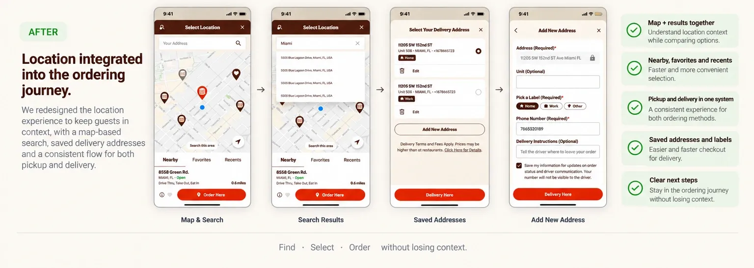
- 01
Map and list together
Map and results work together, helping guests understand location context while comparing nearby restaurants.
- 02
Nearby, favorites and recents
Faster, more convenient restaurant selection built on how guests actually choose.
- 01Find
- 02Select
- 03Order
Without losing context.
05 / Engagement across surfaces
Engagement beyond the core ordering flow.
Not every Burger King interaction needs to begin with ordering. Games, campaigns and kiosk extend the same product thinking beyond checkout — connecting entertainment, brand moments and in-restaurant ordering back into one system.
Gamification & games
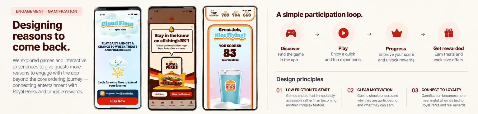
We explored games and interactive experiences that gave guests reasons to interact with the app beyond the core purchase journey — connecting entertainment with Royal Perks and tangible rewards.
- Ordering: transactional value
- Loyalty: progression
- Gamification: participation
Campaign takeovers
Large campaigns can temporarily transform the Burger King experience. Instead of promotional banners layered on top of the product, we designed them as integrated experiences that extend across the ordering journey while preserving the underlying interaction model — Dragon Ball as the primary example.
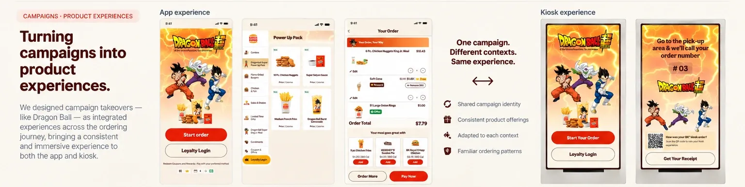
- 01Entry
- 02Menu
- 03Order
- 04Cart
- 05Confirmation
- Brand immersion
- Product usability
- Design system
- Campaign flexibility
Kiosk
Our work on kiosk applied learnings from the digital ordering experience — menu discovery, product selection, customization, cart, loyalty and checkout — adapted to the in-restaurant context. Kiosk was never designed independently from the app; the teams could use learnings from one surface to inform another.
- 01App learnings
- 02Adapt to kiosk context
- 03Test
- 04Iterate
- 05Experiment
- 06Ship
Confirmed impact
Up to +5%
Conversion
06 / Operations & AI
Designing beyond the guest experience.
Part of this role extends past the guest-facing surfaces into internal and operational tools — BK Assistant for franchise management, the Kitchen Display System for restaurant crews — designing for operators as well as guests.
Designing better workflows, not just better interfaces.
Competitive research can quickly become fragmented and outdated. I designed an AI-enabled workflow that continuously monitors key QSR competitors and turns new product signals into structured insights for the design team.
Public signals
- AppMcDonald's — new app feature spotted
- LoyaltyWendy's — loyalty update detected
- WebTaco Bell — website change tracked
- KioskChick-fil-A — kiosk experience update
- OrderingStarbucks — ordering flow change
- ReviewsCustomer reviews — sentiment shift
- NewsIndustry news — QSR digital trends
- ProductCompetitor announcement — new line
AI monitoring
- Identify
- Analyze
- Categorize
Competitive hub
- McDonald'sNew in-app feedback experienceMobileFeedbackView →
- Wendy'sLoyalty tier redesignMobileLoyaltyView →
- Taco BellNew ordering experienceAppOrderingView →
- Chick-fil-AKiosk flow redesignKioskKioskView →
- StarbucksCheckout simplificationMobileCheckoutView →
Weekly Slack digest
Competitive Intelligence · Weekly Update
5+ new competitor updates this week
McDonald'sNew in-app feedback experience
Wendy'sLoyalty tier redesign
Taco BellNew ordering experience
Chick-fil-AKiosk flow redesign
StarbucksCheckout simplification
New findings are automatically added to a shared competitive database, with weekly updates delivered to the design team — surfacing patterns, customer reactions and emerging product opportunities more consistently than ad hoc research allowed.
AI monitors. The system organizes. The team decides.
07 / Business impact
Designing for guests. Measuring what changed.
Across these initiatives, experimentation helped connect design decisions to measurable product outcomes. Below are the results I can share publicly.
Measured impact
+5%
Cart & checkout · conversion
$5M+
Cart & checkout · incremental revenue
First months after launch.
+2%
Customization · conversion
Up to +5%
Kiosk · conversion
08 / Designing at scale
Large products are designed together.
Working across a product this large meant continuously balancing guest needs, research insights, technical constraints, experimentation and business priorities. My role wasn’t simply to deliver screens — it was to help teams understand the problem, align around decisions, test ideas and move the experience toward implementation.
- Product
- Research
- Design
- Engineering
- Analytics
One guest experience. Many surfaces. Shared patterns, components and interaction logic keep the app, web and kiosk coherent, while each surface adapts density, targets and layout to its own context.
Final experience
This is the product I helped evolve.
Learnings
At this scale, every small decision compounds.
- 01
Simplicity is a business decision
Reducing friction can improve both the guest experience and measurable product performance.
- 02
Consistency doesn't mean sameness
App, web and kiosk need shared patterns, but each context requires different interaction decisions.
- 03
Experimentation changes the conversation
Design becomes stronger when decisions can move from hypothesis to user feedback to measurable product behavior.
- 04
Designing the system matters more than designing the screen
Individual improvements become more valuable when they strengthen the journey around them.
At this scale, small interaction decisions rarely stay small. They shape behavior, systems, teams — and sometimes measurable business outcomes.