WEB3 / FINTECH
Flubi
Making Web3 feel less like Web3.
Flubi explores how complex crypto interactions can feel closer to the financial experiences people already understand — clear, familiar and easier to navigate.
View live product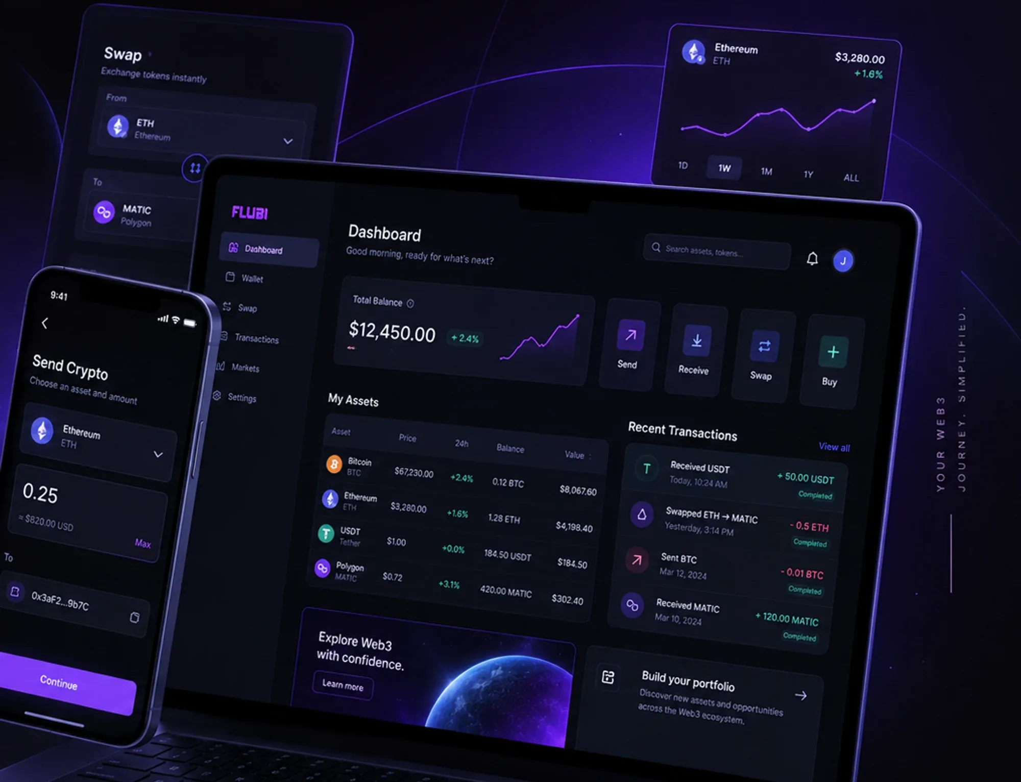
Web3 products tend to expose people to the complexity of the technology behind them — technical terminology, unfamiliar interactions and dense financial information, sitting on top of real business-finance workflows. The work was to translate those interactions into something closer to a familiar financial experience, without removing the information people need to decide with confidence.
01 / Core product flow
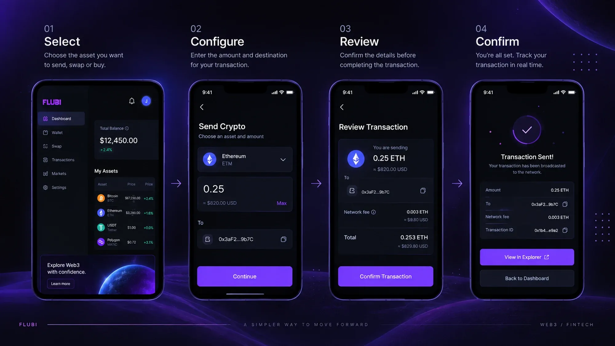
Turning complexity into a predictable journey
Instead of exposing the infrastructure behind every interaction, the experience was organised around the actions people were actually trying to complete — each step designed to make the next one obvious.
- ExploreSee balances, assets and activity in one place.
- SelectChoose the asset and the action — send, swap, buy.
- ConfigureSet the amount and destination, with fees in view.
- ReviewConfirm the details before anything is committed.
- ConfirmBroadcast, then track the transaction in real time.
02 / Key product decisions
Designing around clarity, not complexity
01 / Information
Make financial information scannable
Balances, assets and actions compete for attention in financial products. The interface uses hierarchy, grouping and consistent visual patterns to make important information easier to identify at a glance.

02 / Complexity
Reveal complexity progressively
Technical information stays available without dominating the primary task. The interface prioritises what people need in the moment and exposes additional detail when it becomes relevant.

03 / Interaction
Keep critical actions familiar
Transaction flows use recognizable patterns — configure, review and confirm — helping people understand where they are and what will happen next.
03 / Design language
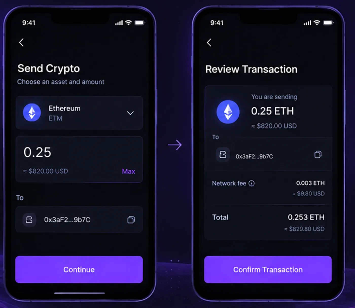
Designed for clarity and confidence
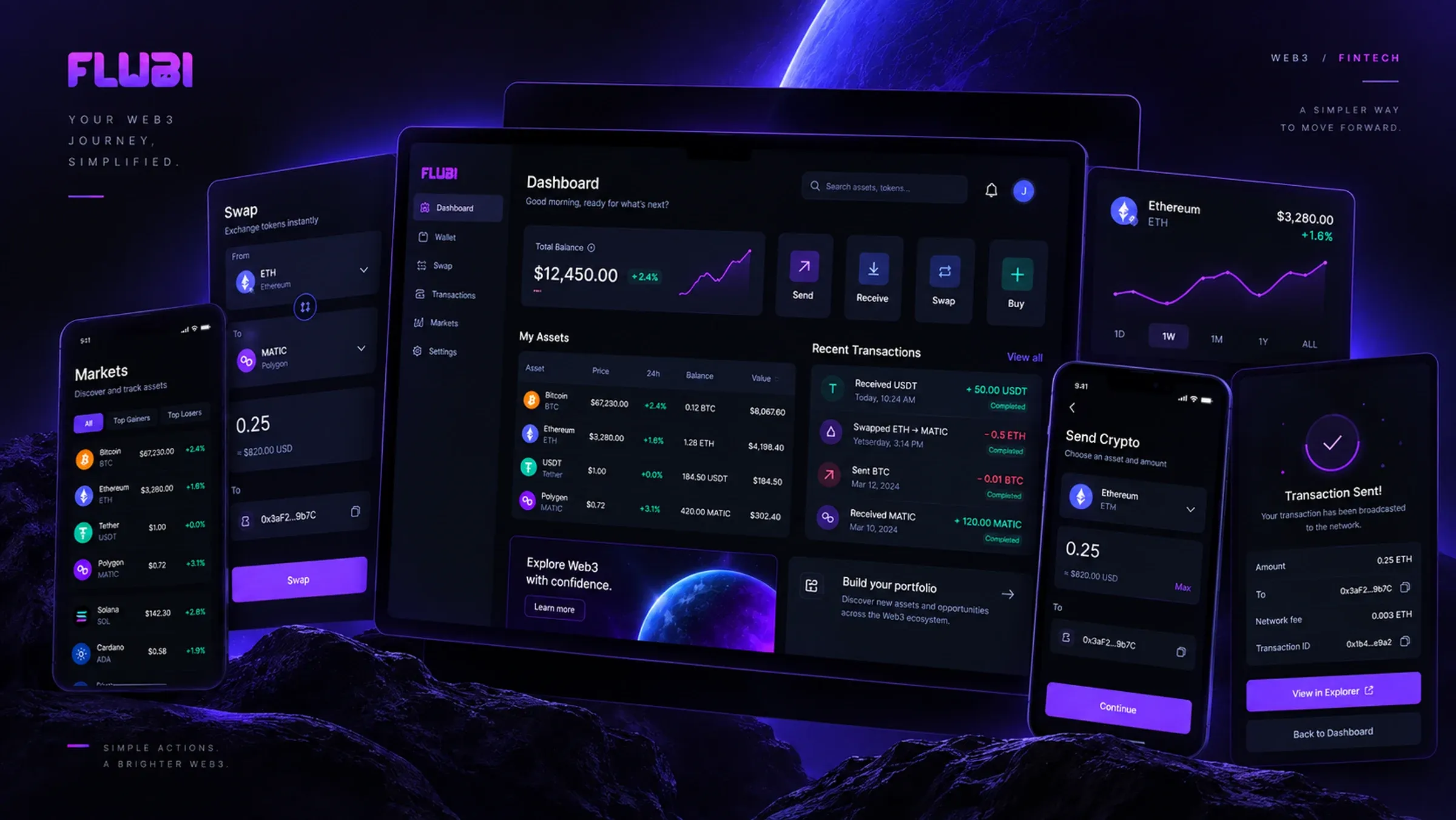
The visual system balances the expressive character of Web3 with the restraint expected from a financial product: a deep, near-black ground, one electric-violet accent used sparingly, and a component set built around legible numbers and honest states.
04 / Final experience
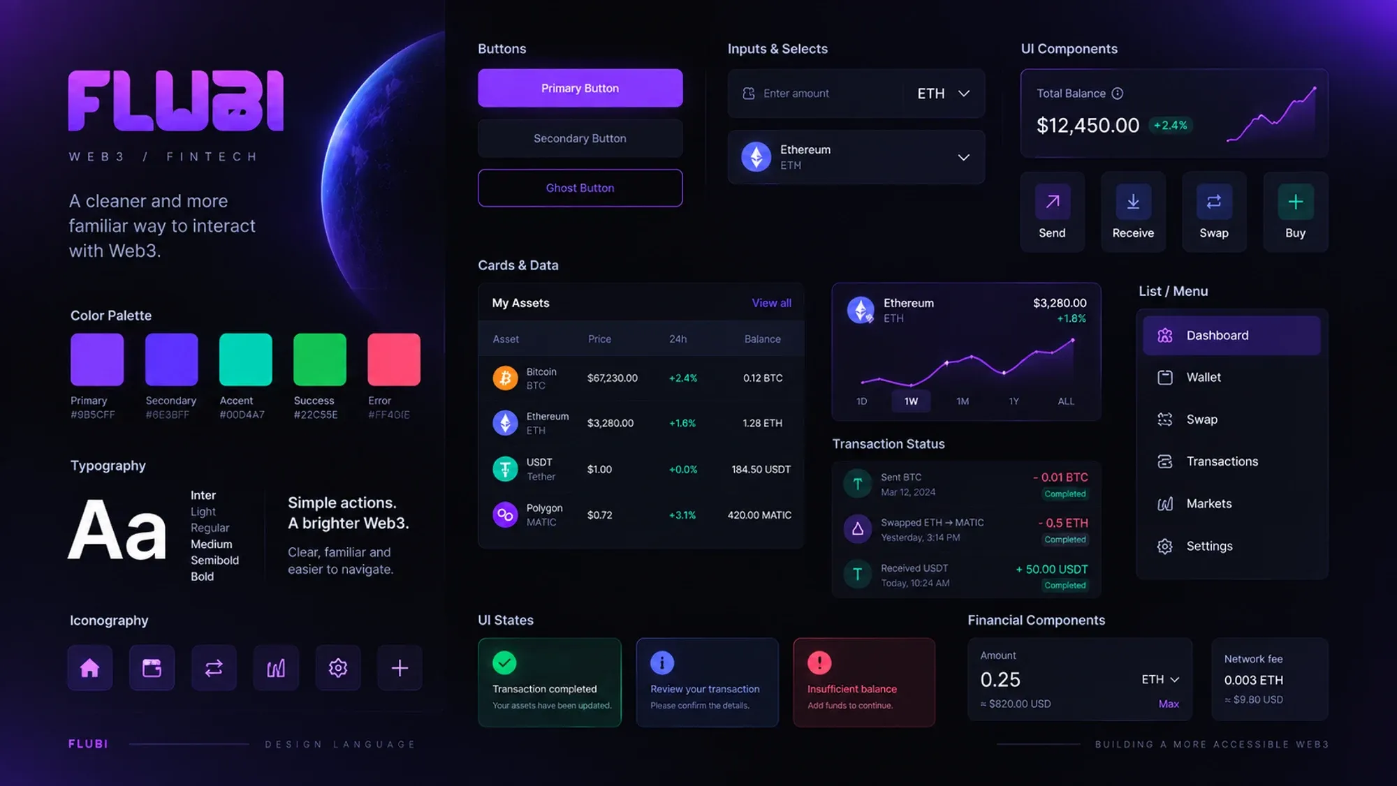
One experience. Complex infrastructure underneath.
05 / Learnings
Complexity doesn't need to become part of the experience
Flubi reinforced a product principle worth keeping: people shouldn’t need to understand the infrastructure behind a product to use it confidently. Familiar patterns, clear hierarchy and progressive disclosure can make a technically complex system feel considerably more approachable.
Clarity over terminology
Familiarity builds confidence
Reveal complexity when it matters